Follow me on Twitter!


Showing posts with label Scoring system. Show all posts

Wednesday, September 9, 2015

Back from the Dead with More 2015 Games Analysis

In late July, I caught a break at work that allowed me to watch the 2015 CrossFit Games nearly uninterrupted from Friday through Sunday.  I kept up with the CFG Analysis Games Pick 'Em daily and took to Twitter several times a day to converse with others about the action.  It was glorious.

The day after the Games ended, things turned around in a hurry.  Free time evaporated quickly, replaced by weekends and nights working just trying to keep up at work.  In past years, I typically like to post my thorough CrossFit Games recap within a few weeks of the end of the Games, but that just hasn't been possible this year.  But I have been able to chip away at a few different analyses, and I figure now is as good a time as any to post what I've found.  I know many of you have moved onto the Team Series (starting today!), but this post will focus on the individual 2015 Games season.


Katrin Tanja Davidsdottir and Ben Smith Deserved It

As I do most years, I looked at the results from this year's Games under a number of different scoring systems, and Davidsdottir and Smith wound up on top in all of them.  Here are the top 3 under the various systems I tested:
  • Classic Points-per-Place (low score wins)
    • Men - Smith, Fraser, Gudmundsson
    • Women - Davidsdottir, Toomey, Sigmundsdottir
  • 2012-2014 Games Scoring
    • Men - Smith, Fraser, Gudmundsson
    • Women - Davidsdottir, Sigmundsdottir, Briggs
  • Normal Distribution Points-per-Place
    • Men - Smith, Fraser, Gudmundsson
    • Women - Davidsdottir, Briggs, Sigmundsdottir
  • Standard Distribution System (not points-per-place)
    • Men - Smith, Fraser, Gudmundsson
    • Women - Davidsdottir, Briggs, Toomey
The top 3 men are actually identical under every scenario I looked into.  The only system I've seen proposed where Davidsdottir doesn't win is a system in which all the athletes who did not complete any reps on Pedal to the Metal 1 were given 0 points.  However, that's not really a system that makes much sense to me.  A more reasonable alternative for the events with large ties is to give all tied athletes the average ranking from that group, rather than the highest possible ranking.  In this case, that would mean giving Davidsdottir and the other 24 women with no reps a rank of 25th, which translates to 30 points, rather than the 54 they did receive.  This would drop her to 766 points, still above Tia-Clair Toomey's actual total of 750.  Keep in mind Toomey also would have lost 12 points under this system, putting her at 738.


Metcons at the Games Keep Getting Heavier

Since the Open began in 2011, the required weights at the Open and Regionals really haven't changed significantly.  Think about it: how many times have we seen 75-lb. snatches required for men in the Open? (answer: 4)  But at the Games, we've seen a steady trend of heavier and heavier metcons over the years.  In 2011, it would have been unreasonable to have 100-lb. dumbbell snatches required in a metcon.  Even something like Heavy D.T. (205/145) would have been a major stretch.

The chart below shows the average relative weight load at the Open, Regionals and Games since 2007.


The chart above does consider the 2014 Clean Speed Ladder and the 2015 Snatch Speed Ladder to be metcons, which I think is reasonable considering the weights are required and the athletes are expected to move the weights quickly.  If we exclude them, the pattern is generally the same, but it flattens out in 2013-2015.  Note that the levels are still well above pre-2013 levels.


2012 Regionals Still the "Heaviest" HQ Individual Competition Ever

Despite these increases in loading for metcons, the 2015 Games was still only the third "heaviest" competition in history, according to load-based emphasis on lifting (LBEL).  That's because the points for the 2015 Games were only 49% from lifting events, which is only slightly above the historical average.  This year's Games had an LBEL of 0.80, which is above the historical Games average of 0.67 but not an all-time high.  The 2014 Games were 55% lifting and therefore had a somewhat higher LBEL (0.89).  This is the highest all-time for the Games, but not among all HQ competitions.

The 2012 Regionals remain the gold standard as far as lifting-biased competitions.  The points at that competition were 67% from lifting events and the average load in metcons was 1.15, which is on par with the 2011 and 2012 Games and higher than the 2013 and 2015 Regionals.  The LBEL at that competition was a staggering 0.92, more than 34% higher than the historical Regional average (0.69).  It's still a minor miracle that Spealler was able to pull out a qualification spot.


Want to Win the Games?  Better Be Able to Run.

Despite having minimal emphasis at the Open and Regional level, we see yet again that running is a huge component at the CrossFit Games.  Running made up 16% of the total points this year, marking the third straight year with at least 11% of the points.  In every year since 2012, running has been one of the top 3 most valuable movements at the Games.

In contrast to what we saw at Regionals, where Olympic-Style Barbell Lifts and High Skill Gymnastics made up a ridiculous 81% of the points, they made up less than 40% of the total points at the Games.  Aside from running, we saw 30% of the points come from Uncommon CrossFit Movements, including swimming, paddle board, sandbag carry, pig flip, yoke carry, assault bike and peg board climb. 

Monday, July 13, 2015

Reliving the Best Individual Event Performances in Games History

Today, with just over a week remaining until the 2015 CrossFit Games kick off, I've decided to look back at some of the most impressive individual event performances in recent Games history.  How to determine the "best" performances?  By using the standard deviation scoring method that I proposed way back when (not that I'm the only one to have proposed it).  Using this method, we compare each athlete's score to the average score in that event, then divide by the standard deviation of scores in the event.  The larger the number, the further above average the athlete was.  This allows us to compare performances across events, and in this case, identify the truly standout efforts.

I'll keep the commentary short here, and instead, point you to videos that you can watch discreetly at work (or in the comfort of your own home, I suppose).  For now, I've limited my analysis to 2012-2014.  I'll try to expand back into the dark ages at some point.  Enjoy:

2013 Legless (women) - Winner: Alessandra Pichelli (4.36 standard deviations above average)
2014 Sprint Sled 1 (men) - Winner: Neal Maddox (3.43 standard deviations above average) - Note: Neal is in the 2nd heat
2014 Cinco 2 (men) - Winner: Rich Froning (3.31 standard deviations above average)
2014 Sprint Carry (men) - Winner: Nate Schrader (3.13 standard deviations above average) - Note: Nate is in the 1st men's heat
2013 Cinco 2 (women) - Winner: Talayna Fortunato (2.89 standard deviations above average)
2012 Rope-Sled (men) - Winner: Matt Chan (2.80 standard deviations above average)

And just for good measure, two of my favorites for the fantastic finishes. Both involve Josh Bridges. I do think the Games will miss him this year.

2014 Push-Pull (probably my vote for the most exciting Games heat of all time)
2011 Killer Kage (note: Bridges actually didn't even win this event, that was Spencer Hendel in a prior heat. But still...)

Thursday, August 21, 2014

Rich Froning's Comeback Could Have Been Even More Amazing (and more scoring system thoughts)

Today will be the first in a series of posts breaking down the 2014 CrossFit Games in more detail.  In the past, I have combined a lot of thoughts into one or two longer posts reviewing the Games (in particular, the programming).  However, this year, due to time constraints from my work and personal life, I'm planning to get the analysis out there in smaller doses, otherwise it might be another month before my next post.  And in fact, this might be the best way to handle things going forward, but we will have to see.  Anyway, let's get moving.

Unlike the past two seasons, Rich Froning did not enter the final day of competition with a commanding lead.  In fact, he didn't even enter the final event with a commanding lead.  All it would have taken was a fifth-place finish by Froning and a first-place finish by Mathew Fraser on Double Grace for Froning to finish runner-up this season.  But what you may not have realized is that it could have been even tighter.

In the Open and the Regionals, the scoring system is simple: add up your placements across all events, and the lowest cumulative total wins.  At the Games, however, the scoring system changes to use a scoring table that translates each placement into a point value.  The athlete with the highest point total wins.  I've written plenty about this in the past (start here if you're interested), but the key difference is this: in the Games scoring system, there is a greater reward for finishes at the very top, and less punishment for finishes near the bottom.  The reason is that the point differential between high places is much higher (5 points between 1st and 2nd) than between lower places (1 point between 30th and 31st).

So you know that small lead Froning had going into the final event?  Well, under the regional scoring system*, he would actually have been trailing going into that event... BY 8 POINTS!  And he would have made that deficit up, because he won the event while Fraser took 11th.  I think it is safe to say that would have been the most dramatic finish to the Games we have seen (I guess Khalipa in 2008 was similar, but there were like 100 people watching, so...).

One reason the scoring would have been so close under this system is that Fraser's performance was remarkably consistent.  His lowest finish was 23rd.  All other athletes had at least one finish 26th or below, and Froning finished lower than 26th twice.  But Fraser also only won one event and had four top 5 finishes.  Froning, on the other hand, won four events and finished second one other time.

I also looked at how the scoring would have turned out under two other scoring systems:
  • Normal distribution scoring table - Similar to the Games scoring table, but the points are allocated 0-100 in a normal distribution.  See my article here for more information.
  • Standard deviation scoring** - This is based on the actual results in each event, rather than just the placement. Points are awarded based on how many standard deviations above or below average an athlete is on each event. More background on that in the article I referenced early on in this post.
Here is how the top 5 would have shaken our for men and women using all four of these systems (including the current system):


As far as the winners go, we would not have seen any changes.  Clearly, Froning and Camille Leblanc-Bazinet were the fittest individuals this year.  Generally, what you can observe here is that the athletes doing well in the standard deviation and normal distribution system had some really outstanding performances, whereas the athletes doing well in the regional scoring system were the most consistent.

What is also nice about the standard deviation system is that it can tell us a little more about how each event played out.  For each event, I had to calculate both the mean result and the standard deviation in order to get these rankings.  That allowed me to see a few other things:

  • Which events had the most tightly bunched fields (and the most widely spread fields)?
  • Were there significant differences between men and women in how tightly scores were bunched on events?
  • Which individual event performances were most dominant?
To measure the spread of the field in each event, I looked at the coefficient of variation, which is the standard deviation divided by the mean.  For instance, the mean weight lifted for women event 2 was 213.6 and the standard deviation was 22.1 pounds, so the coefficient of variation was 10%.  The higher this value, the wider the spread was in the results.  And remember, if the spread is wider, the better you have to be in order to generate a great score under the standard deviation system.

To see which individual event performances were most dominant, I looked at the winning score on each event.  Typically, this score was between 1.5 and 2.75 standard deviations above the mean; this is in the right ballpark if we assume a normal distribution, because there would be about a 7% chance of getting a result of 1.5 standard deviations above the mean and a 0.3% chance of getting a result of 2.75 standard deviations above the mean.

The chart below shows both the winning score (bars) and the coefficient of variation (line) for each event.  Note that the Clean Speed Ladder is omitted because there it was a tournament-style event and does not convert easily to the standard deviations system.  For my calculations of points on the Clean Speed Ladder, I used a normal distribution assumption and applied points based on the rankings in this event.


The largest win was Neal Maddox's 3.43 in the Sprint Sled 1; a normal distribution would say this should occur about 1-in-3,000 times.  For those who watched the Games, this performance was quite impressive.  Maddox looked like he was pushing a toy sled compared to everyone else.  Also, don't sleep on Nate Schrader's result in the Sprint Carry.  It may not have appeared quite as impressive because the field was so tightly bunched (only a 9% coefficient of variation, compared to 23% on Sprint Sled 1).

The most tightly bunched event was the Triple-3 for both men (7%) and women (5%).  The Sprint Carry was next (9% men, 7% women).  The event with the largest spread was Thick-n-Quick, at 53% for men and 41% for women.  Remember, Froning won this event in 1:40 (4.2 reps per minute), while some athletes only finished 2 reps (0.5 reps per minute).

The lesson, as always: Rich Froning is a machine.


*All of the alternate scoring scenarios here assume that the sprint sled events would each be worth half value.
**In order to do this, I had to convert all time-based events from a time score to a rate of speed score (reps per minute, for example).  There are lots of intricacies to this, so another individual calculating these may have used slightly different assumptions.  The main takeaways would be the same here, I think.

Tuesday, April 1, 2014

Can Mid-Week Projections Work?

Two weeks ago, I proposed a method to project an athlete's overall ranking before score submissions had closed for the week. To me, it made sense on paper, but it was admittedly untested. So I put out a request for help on testing it in week 4, and thanks to Andrew Havko (among others), I was able to make that happen.

So can it work? It appears that it can. That's not to say the projections are 100% accurate, and they are far from precise very early each week. But I think it's clear that the projections can give an athlete a good sense of where they would likely finish the week if they stick with their current score, which is something that is nearly impossible currently.

I tested these projections at three points during week 4: Friday 8 a.m., Saturday 5:30 p.m. and Sunday 3:30 a.m. (all EDT). The method requires one key assumption, which is the percentage of athletes who will drop off from the prior week, and for this I used 10%. Certainly this would need a bit more careful thought if it were to be implemented by HQ.

For each athlete, I projected their overall worldwide ranking at each of these times. For athletes whose score did not change by the end of the week, I compared my projection to their ultimate ranking. In total, the error of my projections were as follows:
  • Friday 8 a.m. (<1% of field reporting) - 9,575 mean absolute error*, 9,404 mean error
  • Saturday 5:30 p.m. (16% of field reporting) - 1,003 mean absolute error*, -787 mean error
  • Sunday 3:30 a.m (21% of field reporting) - 1,454 mean absolute error*, -1,362 mean error
Interestingly, the projections (at least using this first basic method) got slightly worse overall from Saturday to Sunday. The reason is that the distribution of scores submitted by Saturday 5:30 p.m. was more similar to the ultimate distribution than on Sunday. What I found was that, in general, the scores submitted very early on during the week are well above average, and the quality slowly declines throughout the week.  That is until Monday evening, when a slew of athletes replace their first score with a second improved submission. It turned out in this case that Saturday afternoon was a pretty accurate indication of how the current week's scores will turn out.

However, let's look a little more closely at the errors. Although an error of 1,003 (our best mean absolute error) is pretty small for an athlete finishing, say, 40,000th, it would be a very large error for an athlete finishing 2,000th. Thankfully, the size of the errors generally increased as the ranking increased. Below is a chart showing the percentage error for athletes across the spectrum of rankings, using our Saturday afternoon projections.


So you see that generally, we never really stray further than 3% error at any point. That's not too bad when you consider that there's currently no way to get even a good ballpark estimate until at least mid-day Monday.

Still, maybe we can do better. What if we had actually used the perfect assumption (8% in this case) for the percentage of athletes who would drop off from the prior week?  Well, in total, we improve for our Saturday and Sunday projections, with the mean absolute error going down to 338 for Saturday and 581 on Sunday. Interestingly, though, in this particular case it doesn't necessarily improve the projections across the board for Saturday and Sunday. Below is the same chart as above, but with the perfect assumption for attrition.


Although our error gets a little worse near the top, once we get near the middle of the pack, these projections are nearly spot-on. And even near the top, a 5% error isn't that bad - that's like these projections putting Josh Bridges at 100th overall, whereas he actually finishes 105th.

One way we can theoretically adjust to get even closer is to make an adjustment for the skill level of the atheletes who have submitted scores at a given point. This could involve looking at the average ranking of the athletes from their prior week's scores and comparing that to what we'd expect by week's end. The trouble is, it's challenging to know what the level will be at week's end. You might expect that the field would average out to be at the 50th percentile in prior weeks, but that wasn't actually the case here. The average athlete submitting a score for 14.4 was actually about the 48th percentile in prior weeks, which is due to the fact that the athletes dropping out after 14.3 were generally from the bottom of the pack.

My point is that while such an adjustment is possible, it might not be practical. And considering the projections even with my base 10% attrition assumption weren't too bad, I don't think further adjustments are necessary, beyond refining that attrition assumption to make it as accurate as we can.

Finally, while I think this method would produce reasonable results if implemented by HQ next year, there are some caveats about the testing done here:

  • I've only done testing for one week. There may be more (or less) error if we made these projections in week 2 or week 5.
  • I'm almost certain that the percentage error would increase a bit if we do this for each region. The sample size is much smaller, which means that even if the same principles apply, we're likely to see more variability. For one thing, it's going to take longer each week before the projections are even remotely meaningful, since many regions had less than 100 entries until late each Friday afternoon.
  • I only tested this for the men's field. I don't see any reason why the results would be much different for women, aside from the field being smaller, which would likely increase our percentage error a bit.
All that being said, I feel that implementing this method would provide a realistic glimpse into where an athlete will wind up. As long as athletes understand that this is merely an estimate, the information provided can be quite useful. 

Would this revolutionize the sport? Of course not. But I think it would be yet another improvement to the athlete experience as the largest stage of our sport continues to grow.


*Mean absolute error is the average of our errors, if we ignore the direction of the error. So if we are off by -500 for one athlete and +500 for another, the mean absolute error is 500 but the mean error is 0.

Monday, March 17, 2014

A Method to Project Overall Open Rankings Mid-Week

One quirk about the Open leaderboard is that while a workout is open for submissions, the overall rankings are basically useless. The rankings for the current week's workout are obviously understated, but as I explained in my previous post, you can at least get a decent sense of where the score will end up by looking at the percentile rank at any point in time. However, with the overall rankings, they are screwed up because the most recent week's rank is so understated in relation to the prior weeks' scores. For instance, if an athlete who was in 300th place in each of the first two weeks but posts the best score in the world early in week 3, he will still appear behind an athlete who finished 290th in each of the first two weeks but is currently 10th of 100 entries in week 3. But we know that by week's end, there will be much more separation between the athletes in their week 3 ranks, which will place the first athlete well in front.

So is there a way we can get at an accurate projection of an athlete's overall ranking mid-week? I think we can, but not without a little bit of work.

The idea is this: since we can reasonably project the ending percentile ranking for the current week's workout, we should be able to reasonably project the ending rank, if we make an assumption about how many athletes will complete the workout. If we can get that projection for any particular athlete, we should be able to do that for all athletes who have completed the workout. At that point, we can re-rank those athletes based on projected total points. Using that, we can basically "scale up" those ranking based on how many athletes we anticipate will complete the current week's workout.

More specifically, here is the process I am proposing:
  • Compute each athlete's percentile ranking for the current week (either overall or in the region) based on the athletes who have currently submitted scores
  • Based on the number of athletes in contention at the end of the prior week, reduce that by some factor (say 10%, which is near the historical average) to get an estimate of the number of athletes who will remain at the end of the current week
  • Multiply the athlete's percentile ranking by the estimated number of athletes who will remain at the end of the current week to get the projected rank for the current workout
  • Use these projected ranks to get a projected overall point total at the end of the current week
  • Re-rank the athletes who have submitted scores based on the projected point totals
  • Convert the projected rankings to a percentile rank based on the number of athletes who have currently submitted
  • Multiply this percentile by our earlier estimate about how many athletes will remain at the end of the current week. This will give you each athlete's projected overall rank at the end of the week.
To accomplish this, all we would need a snapshot of the full leaderboard at a given point in time. I do not think it is possible to accomplish this even for a single athlete without making the calculations for all athletes. However, with the right computing power, it would be a relatively painless calculation to generate the projected overall rankings. Obviously HQ would be in the best position to perform these calculations, but I think it is conceivable that someone on the outside could do this as well.

This is all theoretical at the moment - a decent amount of testing would be necessary to make sure this process actually produces reasonable projections. Still, I think the concept is something that could be used to improve the Open experience for all of us.

Note: If anyone out there has the resources and the know-how to get a hold of the leaderboard mid-week and get it into Excel or .csv, I'd be very interested to test this out. If so, post to comments or email me directly (anders@alumni.wfu.edu).

Monday, March 25, 2013

Fun With SWAGs: What Will 13.4 Be?

Welcome to week 4 of the 2013 Open. After a disappointing showing with my scientific wild-ass guess (SWAG) last week, I'm dialed in and ready to roll for week 4. But first, I wanted to address a question from the comments about my post on points needed to regionals. I think it's a topic that actually feeds nicely into the prediction for this week.

Reader Brian Gresham pointed out that we're seeing pretty low point totals for the top 48 athletes in most regions compared to what I had been projecting. For instance, the 48th place male in the Central East region has 211 points, which is still about 400 points shy of my 'mid' prediction through 5 weeks. What are some possible reasons for this? Well, first, I think the fact that we only have two years of data makes it tough to be accurate, especially when most regions are substantially bigger than the biggest region in 2012 or 2011. Secondly, I think I'll probably re-visit this model next year and consider fitting a square-root (or some over concave down curve), because the slope probably flattens out as the regions get bigger and bigger. Third, let's keep in mind that we've only had three weeks, and these point totals could jump up a lot in the final two weeks. Still, if I'm a betting man, I'm betting my models over-predicted.

But that being said, a big reason for this is the programming this year. The three workouts have all been relatively similar, especially compared to the first three workouts last year. Remember, if you programmed Fran for 5 straight workouts, you'd probably be looking at a very low point total to finish 48th because the results would be really similar every week. Here's what we've seen through 3 weeks in 2011, 2012 and 2013:


2011: Time domains of 10, 15, 5. A couplet, triplet and single modality (if you count C&J as one movement). One very heavy workout that really mixed up the standings, plus one workout that relied heavily on double-unders, which always can shake things up.

2012: Time domains of 7, 10, 18. Two single-modalities and a triplet. One workout completely favoring smaller athletes and one athlete completely favoring heavier athletes. This definitely leads to big variation in points week-to-week.

2013: Time domains of 17, 10, 12. Two triplets and a couplets. The burpees on 13.1 seemed to hold back some of the pure strength folks (even Olympic games weightlifter Chad Vaughn barely cracked 150). No extremely heavy workouts, no extremely light workouts (though 13.2 was all about conditioning).

Clearly through 3 events, 2013 has had the most homogenous programming. In fact, through 3 events last year, the 48th place male in the Central East actually had 308 points despite a field that was half the size of this year's field. I don't think the programming has been bad, and in fact, I've argued in the past that testing single modalities in the Open isn't a great idea for exactly the reason that they can allow athletes who aren't as well-rounded to shake things up too much. There are only 5 workouts, so we want ones that tell us a lot about the athletes.

Now, what does that mean for 13.4? Well, looking at that comparison of 2011-2013, we can see what's missing from this year's programming: short and heavy. The average time has been 13:00, compared to the 2-year average of 11:00. The load-based emphasis on lifting (LBEL) through 3 events this year is about .41 for men and .25 for women, which is below the 2-year averages of .48 and .31. The average relative weight also is low at .81 and .50, compared to 2-year averages of .96 and .62. Not that HQ is necessarily thinking in terms of these exact numbers, but I think it's a reasonable assumption that by the end of week 5, we'll end up with similar numbers to the past two years.

Let's also consider what movements are still on the table, with the number of times they've appeared in past Opens in parentheses: pull-up (2), thruster (2), toes-to-bar (2), clean (1), overhead squat (1), push-up (1). For the sake of judging, I'm going to pray they don't put in push-ups. So that leaves the other 5 movements. I also highly doubt we'll see 11.6/12.5 repeated again, since they just repeated 12.4. So, with all that in mind, here's what I got for 13.4:

AMRAP 6 of 3 squat clean thrusters (155/100), 9 pull-ups (chest-to-bar) - squat clean & jerks are allowed

Feel free to throw in your best SWAG in the comments. I promise a serious high-five if and when we meet if you get it right. Good luck to everyone on 13.4!


Monday, March 11, 2013

How Few Points Do You Need to Make Regionals?

[Note: I goofed the first time I posted this (Monday afternoon), forgetting that 2011 had 6 events, not 5. The final results in this updated post are similar, but some of the methodology had to change. I'm on vacation, so I'm doing my best to post this revised version quickly despite a pretty slow internet connection.]

Today I’d like to take on a topic that may be irrelevant to 95% of the competitors, but which is of great consequence to the remaining 5%. Although we know exactly how well athletes overall must place in order to reach the regionals (ignoring for a moment the vagueness surrounding whether HQ will invite a few extra athletes in certain regions), we do not know exactly how well an athlete needs to do in each particular workout in order to finish well enough overall. In fact, we cannot know this for sure, no matter how much research we do and how robust a model we might use to predict it.

For the purposes of this post, let’s assume that an athlete needs to finish in the top 48 in his/her region to qualify for the regionals. To be sure, placing 48th or better in every workout would guarantee this (that’s 240 points). But given the nature of our sport, we know it’s not necessary to place that high in every event. Because of the way athletes’ performances vary between events, athletes finishing toward the top of the standings on each event will tend to finish higher than the average of their individual event placements. Conversely, athletes near the bottom will tend to finish lower than the average of their individual event placements. So for athletes near the top, the question is, just how far can you afford to fall in each event and still keep your hopes alive? I hate to be the bearer of bad news, but for about 80% of the athletes, their first event score alone will be too many points to qualify for regionals. That’s the nature of the points-per-place system: there are some holes you simply cannot dig yourself out of.
So how can we try to estimate the number of points necessary? Well, based on the data available, our best shot is to develop a model based on the number of competitors in each region to try to estimate the number of points you’ll need at the end of week 5. Without knowing any more about each region (are certain ones more top-heavy than others, for instance), this is really all we can base our estimate on. Let’s start by looking at what happened last year.

I went through each region’s 2012 results and recorded the following information: the point total of the 48th and 60th place athletes and the total number of competitors that competed in week 1. I did this separately for men and women. I’ll focus on the 48th place model for now but I’ll throw in some results for the 60th place model at the end, since it’s possible that HQ will end up taking athletes who finish that low. Below are scatter plots for both men and women, with the number of week 1 competitors on the x-axis and the 48th place points on the y-axis. (I apologize for the small charts. I'm posting this from a different computer and it's not letting me size the charts when I post them to the blog. Hopefully I can get them re-sized eventually.)

To me, the relationship looks roughly linear with an intercept near 300 or so. We know there is no way that the 48th place athlete can possibly score fewer than 240 points (mentioned earlier), even if there are only 60 or 70 athletes. From that point, however, the number of points needed rises as the field gets larger, and thus more competitive. We could simply slap a linear estimate on here and call it a day, but I think it might be a bit more complicated. I also decided to look at 2011 – would we see the same type of relationship there? Well, sort of. 

Below are scatter plots for the men in 2011 and 2012, each with their own linear fit on the graph to help illustrate the point. (Note: To get the 2011 points, I tried to get an estimate of what the points would have been after 5 weeks. Since I was a little strapped for time, I looked at the total points after 6 weeks and then scaled it back to about 75% of that number. That 75% figure was based on looking at a few regions and actually calculating out the rankings after 5 weeks. That would have been too time-consuming to do for every region, though.)


We can see that the intercept is lower for the 2011 group, but the slope of the line is steeper. It's tough to use 2011 to infer too much from these differences, however, because the region sizes were generally so much smaller in 2011.

So what do we do about predicting this year? Well, I decided to come up with three different models to provide a bit of a range. The first model is based solely off of 2012. This produces the "mid" estimate. Using all the data points from 2011 and 2012 produces a steeper line (the "high" estimate) that is higher for the larger groups but slightly lower for very small groups. The third model ("low" estimate) assumes that the slope of the line will continue to decrease in 2013, similarly to the way it did from 2011 to 2012. I repeated this process for the women as well.

Below is are the three men's models in graphical form.


For the men, the mean absolute error was 27 the 2012 model and 25 for the 2011-2012 combined model. For the women, the mean absolue error was 19 the 2012 model and 21 for the 2011-2012 combined model. Keep in mind those were the errors on the historical data; the tricky part here is estimating how well these models will translate to 2013.
 
There is no doubt that there is a bit of "fuzzy" math going on here due to the data limitations we're facing. But despite the difficulties in making these estimates, I think they do provide some insight into what types of scores you’ll need to make it to regionals. People tend to get concerned if they finish 100th or 150th in event 1, but realistically, in many larger regions you probably can still make it just by hitting those numbers each week. That being said, there’s no doubt I’d be sweating bullets those last few weeks if I was anywhere near the cutoff, so if you feel like you need to hit a workout two (or three) times, I won’t stand in your way.

Here are my final estimates. To use them, find the number of athletes in your region, then find that number (as closely as you can) on in the column on the left. For example, in my region, the Central East, we have about 4,800 men's athletes at the end of week 1, so my mid estimate is that 637 points (about 127 per week) will put you in 48th and 728 points (about 146 per week) will put you in 60th.


*Note: I think an interesting analysis for another day would be to look at the number of athletes in each region who actually impact the standings at the top. You could do this by removing each athlete from the competition and testing whether the point totals of the top 48 (or 60) athletes changed at all. This number of athletes would probably correlate much more strongly to the number of points needed to make regionals. However, a difficult task would be estimating this number for 2013 so we could make predictions. But it’s something to consider.

Sunday, March 3, 2013

WOD Design and Why It (Usually) Pays to be Well-Rounded

With the Open just a few short days away, I wanted to look at how the design of a CrossFit workout can affect the results we see in competition. I considered writing a last-minute manifesto on why HQ should not program 7 minutes of burpees for the first workout, but I've resigned myself the inevitability of that happening on Wednesday night, so let's just move on. (Reverse jinx right there? Maybe...)

It goes without saying that CrossFit is a sport that demands its athletes be strong in all areas of fitness. Any glaring weakness will eventually be exposed, and no one is winning the CrossFit Games (or even making it there) with a major deficiency in any area. That being said, simply because a movement comes up in a workout does not tell us exactly what type of emphasis is placed on it. In my earlier post "What to Expect From the 2013 Games and Beyond," I summarized all the movements used in the last two years of competition based on how much of the total score they represented. To do this, I assumed that in a workout with 3 movements, they were each worth 1/3 of the score. While this does give us a good idea of the value of each movement in aggregate, the truth is that it doesn't tell the whole story.

Consider two workouts, both comprised of thrusters and pull-ups. Workout A is 3 minutes of thrusters followed by 3 minutes of pull-ups, with the total number of reps as the score. Workout B is "Fran" (21-15-9 rounds of thrusters and pull-ups). Below are two charts showing how an athlete would fare given his/her rate of pull-ups per minute and his/her rate of thrusters per minute. The red cells represent better scores and the green cells represent poorer scores.


Look first at the top chart. You can see that the scores are identical along each diagonal, moving from top right to lower left. That's because you can exactly offset a deficiency in one movement with an equivalent improvement in the other one. Doing 30 pull-ups per minute and 20 thrusters per minute produces the same score as 25 per minute of each.

Now look at the chart for Fran. In this case, the best scores always occur when the athlete is balanced. Performing 25 thrusters per minute and 25 pull-ups per minute produces a time of 3.6 minutes (~3:36). Improving the pull-ups to 30 per minute but decreasing the thrusters to 20 per minute produces a time of 3.8 (~3:48). The reason for the discrepancy involves some pretty simple algebra.

In a workout where a certain number of reps has to be performed at each station, the time needed to finish a station is (reps needed) / (reps per minute). If we improve our speed by 20%, that lowers the time for that station to (1 / 1.2) = .83 times the original time. If we decrease our speed by 20%, it increases the time for that station by (1 / 0.8) = 1.25 times the original time. In total, our new time is ((.83 + 1.25) / 2) = 1.04 times the original time. So you can see the punishment for a poor movement is greater than the reward for a strong movement. In a workout where there is a fixed time domain per station, we don't have this effect.

One way to quantify this effect is to look at the drop in performance in a workout that occurs when we drop the speed of one movement by 20% and increase the other movement(s) by a total of 20%. So if there are three movements, we drop one by 20% and increase the other two by 10%. 

I'll also need to make some assumptions are necessary about the "base" speed for each movement. "Fran" was an easy example above because it's reasonable to assume that on average, thrusters and pull-ups take a similar amount of time for most athletes. That isn't necessarily the case with other workouts. My estimates for these base speeds for each movement are roughly based on my own results, but I also was trying to represent a relationship between the movements that is pretty typical for CrossFitters. But I will admit, there are no exact answers for this. Changing these assumptions based on the level of athlete will certainly change our answers, and I'll go more into that in a moment.

Let's look at a few workouts from the Open in years past. A few notes first: 
  • The result for each movement is what I'm calling "leverage." It represents the decrease in performance if we drop the speed of a given movement 20% and increase the others by 20% (in total).
  • I'm using a using a 20% decrease for each movement, but that's just an arbitrary choice. Any other choice (10%, 30%, 40%, etc.) would yield slightly different results, but the concept is the same. 
  • The term "Rate" here means the speed, in terms of stations per minute (it's just the inverse of the minutes per station, which I listed first because it's easier to comprehend).
  • I calculated the score as the number of stations, not the total number of reps. That's because all reps are not equal: one double-unders doesn't mean as much as one muscle-ups. All stations aren't necessarily equal, either, but it's better than simply counting reps.

OK, onto the results.


WOD 12.3 is pretty much a classic CrossFit workout. For most athletes, all three movements take a similar amount of time, although I think it's fair to say the push jerks were generally the slowest, especially as the workout wore on. You see that each movement is leveraged a decent amount, but athletes who struggled on push jerks were punished the most.


For WOD 11.1, based on the assumptions I've used, the snatch was the more critical movement, despite being the second of two movements. For athletes who have solid double-unders, they will almost certainly be slower on the snatches. This means that a deficiency on the snatch is really exposed, whereas the double-unders weren't punished too much, so long as the athlete didn't have a catastrophic weakness.


WOD 12.4 was an interesting case. The wall balls took up a big chunk of time for all athletes, while the double-unders should be comparatively quick for athletes who are pretty competent with them. For most athletes, the muscle-ups are going to be slow, especially at that point of the workout. But what is also key here is that the order of movements is critical. Athletes who struggle with wall balls will be punished hard, and they may not even make it to the double-unders or muscle-ups, hence we see the 7.5% leveraging factor. Conversely, the double-unders and muscle-ups were actually negatively leveraged, meaning this athlete would actually benefit if he/she got 20% slower at that movement but 10% faster at each of the other two. I'm sure that shorter athletes who may excel at muscle-ups but struggle with wall balls can probably relate to this fact.

Now let's look at 12.4 once more, but for an elite athlete who is gunning for about 1 full round.


You can see that for the elite athlete, the muscle-ups become much more important, while the wall balls aren't quite as critical as for the intermediate athlete. Still, though, slightly slower double-unders were not a problem if you could offset that deficiency with strengths elsewhere.

Now, I tend to prefer workouts like 12.3, where the stations have relatively similar time domains and no single movement can make or break the workout. However, I believe there are reasons for designing workouts where certain movements are leveraged significantly more than others. For one, since the Open is designed to be inclusive, the workouts will almost always start with the movement that is easier to complete for one rep. This allows the maximum number of athletes to compete. I'd be stunned if we ever see a workout in the Open start with muscle-ups.

Another issue is that certain movements are prone to have a wider range of speeds than others. For instance, wall balls are basically capped around 30-35 reps/minute due to gravity, so it takes more reps for athletes to really separate themselves. With something like muscle-ups, however, a set of 20 muscle-ups can separate even the best athletes in the world by quite a bit. So perhaps it makes more sense to design the workout so that the wall ball stations take twice as long as the muscle-up station. I notice this a lot with rowing: if you're not careful, the row can become a throwaway movement (as far as competition is concerned) unless you devote a considerable portion of the workout to that movement. The difference between a strong and weak rower just isn't that wide, even over something like 1,000 meters that takes more than 3 minutes.

So what can we take away from this? Well, personally, I learned a few things in doing this analysis, or at least put some numbers behind some things I (and likely others) sensed intuitively:

1) You can't offset any weakness by simply being stronger in another area. In general, it pays to shore up weaknesses across the board rather than improving in areas you are already strong.

2) This concept varies depending on the workout. In some cases, you can actually benefit from being particularly great in one area and weaker in others. Sometimes this means the workout isn't perfectly designed. However, it could be because HQ is programming the workout to account for the fact that certain movements take more time/reps to separate athletes than others.

3) Order matters in an AMRAP. We saw this clearly in WOD 12.4. And although I didn't show it as an example above, the thuster/pull-up ladder (WOD 11.6 & 12.5) also is a great example. For athletes with a base speed of 15 reps/minute on each movement (105 reps for the workout), the thrusters are leveraged at 5.7% and the pull-ups are leveraged at just 1.4%.

4) Testing movements together, with a required number of reps on each movement, will punish weaknesses more than testing them separately. For instance, something like AMRAP 10 of 10 snatches (95/65), 10 burpees will punish the specialist more so than AMRAP 7 of burpees followed by AMRAP 10 of snatches. (Sorry, I know I promised not to argue against the 7 minutes of burpees, but I couldn't resist...)

So these are some intriguing conclusions, but what can we do with this moving forward? Well, there are two ways I can see this type of analysis being applied moving forward:

1) Once a workout is released, athletes can start to understand what the keys to the workout will be. If we plug in some assumptions for a certain level of athlete, we can see how much each movement is leveraged based on the workout design. That might provide some insight on how to attack a workout. For 12.4, we can see that the hitting the gas on the wall balls might be worthwhile, even if the double-unders suffer a bit. Again, this may have been intuitive to many athletes/coaches, but seeing some numbers can help to clarify things.

2) We can assess what worked and didn't work in programming a competition. In theory, you could actually look back and calculate how long it took (on average) for athletes to complete each movement, and then use that information to get a clear picture of how much each movement truly was leveraged. Did you adequately test the movements you wanted to? Was the workout balanced? If not, was that by design? Just because a workout seemed friggin' awesome when you wrote it up doesn't mean it actually turned out to be a great test of fitness.


Anyway, that's all for today. Time permitting, I'm hoping to post something each week during the Open. No guarantees on exactly what those posts will look like or what type of analysis I'll be doing, other than to say I'll be talking about the Open. So pop on over this way from time-to-time during the week - it's got to be a healthier habit than leaderboarding. 

Sunday, November 18, 2012

If We're Going to Stick With Points-per-Place, A Suggestion

After the positive response in the past few days to my post about what to expect from the next Games season, I'd like to continue to write more about training for the upcoming season. I don't purport to be an expert trainer, and I'm certainly not going to be prescribing any workouts, but I hope I can provide a different perspective on the Games and get some discussion started on programming for training vs. competition. But, alas, my schedule this past week just did not give me the time to get into that topic in full detail yet.

Today, I've just got a follow-up on my earlier post regarding the CrossFit Games scoring system ("Opening Pandora's Box: Do We Need a New Scoring System"). In fact, this is actually a follow-up to a comment to that post.

Tony Budding of CrossFit HQ was kind enough to stop by and respond to my article, in particular my suggestion that we move to a standard deviation scoring system. You can read my post and Tony's comment in full to get the details, but the long and short of it is this: HQ is sticking with the points-per-place system for the time being. I'd like to keep the discussion going in the future about possibly moving away from this system, but for now, I accept that the points-per-place is here to stay. Tony made some good points, and I understand the rationale, though I stand by my argument.

Anyway... Tony mentioned that they are still working on ways to refine the system. Certain flaws, like the logjams that occurred at certain scores (like a score of 60 on WOD 12.2) are probably fixable with different programming, and there are some tweaks that could be made to address other concerns (for instance, only allowing scores from athletes who compete in all workouts). But I had another thought that would allow us to stick with the points-per-place system while gaining some of the advantages of a standard deviation system.

At the Games for the past two years, the points-per-place has been modified to award points in descending order based on place, with the high score winning (in contrast to the open and regionals, where the actual ranking is added up and the low score wins). In addition, the Games scoring system has wider gaps between places toward the top of the leaderboard. In my opinion, this is an improvement over the traditional points-per-place system because it gives more weight to the elite performances. However, I think we can do a little better.

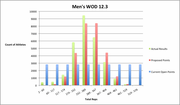
First, here is my rationale for why we should have wider gaps between the top places. If you look at how the actual results of most workouts are distributed, you'll see the performance gaps are indeed wider at the top end. The graph below is a histogram of results from Men's Open WOD 12.3 last year:


There are fewer athletes at the top end than there are in the middle, so it makes sense to reward each successive place with a wider point gap. However, the same thing occurs on the low end, with the scores being more and more spread out. But the current Games scoring table does not reflect this - the gaps get smaller and smaller the further down the leaderboard you go (the current Open scoring system obviously has equal gaps throughout the entire leaderboard).

Now, another issue with the current Games scoring table is that it's set up to handle only one size of competition (the maximum it could handle is around 60). So let's try to set up a scoring table that will address my concern about the distribution of scores but can be used for a comeptition of any size (even the Open).

Obviously, the pure points-per-place system used in the Open will work on a competition of any size, but what is essentially does is assume we have a uniform distribution of scores. Basically, the point spread between any two places is the same regardless of where you fall in the spectrum. So what happens is the point difference between 100 burpees and 105 burpees becomes much wider than the gap between 50 and 55 or 140 and 145. So my suggestion is this: let's use a scoring table that ranges from 0-100 but reflects a normal (bell-shaped) distribution rather than a uniform (flat) distribution. The graph below shows that same histogram of WOD 12.3 (green), along with a histogram of my suggested scores (red) and a histogram of the current open points (blue). The scale is different on each histogram, but there are 10 even intervals for each, so you can focus on how the shapes line up.


You can see that the points awarded with the proposed system are much more closely aligned with the actual performances than the current system. And this was done without using the actual performances themselves - I just assumed the distribution of performances was normal and awarded points, based on rank, to fit the assumed distribution.

Now, you may be asking, how well does this distribution fare when we limit the field to only the elite athletes? Well, the shape does not tend to match up as well as we saw in the graph above. Part of this is due to the field simply being smaller, so there is naturally more opportunity for variance from the expected distribution. However, for almost every event in last year's Games, there is no question that the normal distribution is a better fit than the current Games scoring table. The chart below shows a histogram the actual results from the men's Track Triplet along with the distribution of scores using the proposed scoring table and the current scoring table. I have displayed the distribution of scores from the scoring table with lines rather than bars to make the various shapes easier to discern.


As stated above, we do not perfectly match the actual distribution of results. But clearly the actual results are better modeled with the normal distribution than with the current scoring table. As further evidence, the R-squared between the actual results and the proposed scoring table is 96.0%; the R-squared between the actual results and the current scoring table is only 83.9%. If we make this same comparison for each of the first 10 events for men and women (excluding the obstacle course, which was a bracket-style tournament), the R-squared was higher with the proposed scoring table than with the current table, with the exception of the women's Medball-HSPU workout.

I believe this proposed system, while not radically different than our current system, would be an improvement but would not have any of the same issues that concerned HQ about the standard deviation system. While the math used to set up the scoring system may be difficult for many to digest, that's all done behind the scenes and the resulting table is no more difficult to understand than the current Games scoring table, especially if we round all scores to the nearest whole number. If used in the Open, we'd almost certainly have to go out to a couple decimal places, but I think otherwise this system would work fine. And since we are still basing the scores on the placement and not the actual performance, this system also does not allow, as Tony said, "outliers in a single event [to] benefit tremendously." It does, however, reward performances at the top end (and punish performances at the low end) more than the current system.

I appreciate the fact that Tony took the time to review my prior work, and I hope that he and HQ will consider what I've proposed here.


*Below is the actual table (with rounding) that would be used in a field of 45 people (men's Games this year), compared with the current system.


**MATH NOTE: In case you were wondering, here is the actual formula I used in Excel to generate the table: 

POINTS = normsinv(1 - (placement / total athletes) + (0.5 / total athletes)) * (50 / normsinv(1 - (0.5 / total athletes)) + 50

This first part gives us the expected number of standard deviations from the mean, given the athlete's rank. Next we multiply that by 50 and divide by the expected number of standard deviations from the mean for the winner (this will give the winner 50 points and last place -50 points). Then we add 50 to make our scale go from 0-100.

Wednesday, September 5, 2012

Quick Hits: What Can We Learn from the Standard Deviation System?

After posting a lengthy essay on the benefits of switching to the Standard Deviation scoring system, I felt like I had to apply the scoring system to this year's Games and see what I could learn. Obviously it would be interesting to re-calculate the final standings with the new system, but I think there are a few other things that we can do with this new system. Because we are now scoring based on performance rather than simply rank, this new system allows us to compare events and individual performances across separate events. I'll try to keep this one relatively short, just hitting on the highlights of what I found.

Remember all events are converted to a power output (think reps or stations per minute, instead of time to completion). This was a painful process b/c of the way HQ scored athletes who did not finish a workout in the allotted time. I also generally assumed every "station" was worth equal weight (so on the Medball HSPU, the 8 medball cleans were equal to the 7 HSPU). This was the simplest solution. On the obstacle course, because I was basically forced into using the rankings and not the actual performances, I assumed a normal distribution and converted the ranks to an equivalent number of standard deviations from average. If HQ were to adopt this scoring system, they'd have to make the decision on how to weight the stations.

Anyway, enough with the math and onto the results:

Which event had the widest spread?

We can judge this based on the coefficient of variation for each event, which is the standard deviation divided by the average.

For the men, the widest spread came in the Medball-HSPU workout. The average score was 0.60 stations/minute (9:56) and the standard deviation was 0.18 stations per minute, giving us a coefficient of variation of 29%.

For the women, the widest spread also came in the Medball-HSPU workout. The average score was 0.56 stations/minute (which translates to finishing in 10:48, which is over the cap) and the standard deviation was 0.32 stations/minute, giving us a coefficient of variation of 58%. This shouldn't be surprising, considering the winning time was just over 5 minutes, but more than half the field didn't even finish.

Which event had the tightest spread?

For the men, the tightest spread came in the sprint. The average score was 6.60 meters/second (45.48 seconds) and the standard deviation was just 0.32 meters/second. The coefficient of variation was 5%. The second-tightest was Pendleton 2 at 8%.

For the women, the tightest spread also came in the sprint. The average score was 5.83 meters/second (51.49 seconds) and the standard deviation was just 0.31 meters/second. The coefficient of variation was 5%. The second-tightest was the clean ladder at 8%.

What was the most dominating individual performance over the field?

We'll measure this based on the number of standard deviations from the mean by the winner.

For the men, this came in the Rope-Sled event, where Matt Chan had a result of 1.32 stations/minute (7:33.6), which was 2.80 standard deviations above the average score of 0.87 stations/minute (11:48).

For the women, the most dominating performance came in the clean ladder, where Elisabeth Akinwale had a score of 235.6, which was 2.42 standard deviations above the average of 195.76.

What were the widest and tightest margins between first and second in an event?

Similarly, we're looking for the standard deviations between the first and second place finish.

For the men, the widest gap came in the Rope-Sled event. Chan was 0.89 standard deviations ahead of second-place Jason Khalipa, who had 1.18 stations/minute (8:27.0). The closest event came in the sprint, where Nate Schrader finished in 7.14 meters/second (42.0 seconds), just 0.11 standard deviations ahead of second-place David Levey at 7.11 meters/second (42.2 seconds).

For the women, the widest gap came in Elizabeth. Deborah Cordner Carson had a score of 25.09 reps/minute (3:35.2), which was 1.04 standard deviations ahead of second-place finisher was Kristan Clever at 21.79 reps/minute (4:07.8). The tightest race came in the clean ladder, where Lindsay Valenzuela basically tied Akinwale (she had the same lift but completed one fewer deadlift).

*In the events before any cuts, the biggest gap on the women's side came in the ball toss, where Cheryl Brost's score of 61 points was 0.53 standard deviations ahead of second-place Elizabeth Akinwale (57 points).

Seriously, what do the revised standings look like?

OK, I'm going to caveat this by saying that it's not totally fair to say the standings would have looked like this if we had scored the event differently. Obviously the athletes may have approached workouts differently had they been higher or lower in the standings, and they may have pushed harder for those extra few points in each event when more than just a simple ranking was involved. I think this is probably the least important thing we can learn from the new scoring system, since the event is done and there's nothing we can do to change it.

But that being said, for amusement purposes only, here is your revised top 12 for men and women (no one from outside the top 12 could move into the top 12 because of the cuts):

*UPDATED 1/19/2013 - An error in the Obstacle Course scoring has been fixed and these have been revised. Only major shift was Foucher going from 4th to 2nd on the women's side. Otherwise pretty similar to prior results. 
Men
1. Rich Froning (15.49)
2. Matt Chan (11.97)
3. Scott Panchik (8.75)
4. Jason Khalipa (7.99)
5. Kyle Kasperbauer (6.96)
6. Dan Bailey (6.57)
7. Austin Malleolo (5.27)
8. Marcus Hendren (4.82)
9. Nate Schrader (4.23)
10. Graham Holmberg (4.07)
11. Ben Smith (2.77)
12. Chad Mackay (1.78)


Women
1. Annie Thorisdottir (13.70)
2. Julie Foucher (9.19)
3. Talayna Fortunato (8.77)
4. Kristan Clever (8.55)
5. Camille Leblanc-Bazinet (6.14)
5. Lindsey Valenzuela (5.65)
6. Elisabeth Akinwale (5.60)
8. Valerie Voboril (5.28)
9. Jenny Davis (4.74)
10. Rebecca Voigt (2.84)
11. Stacie Tovar (1.43)
12. Christy Phillips (0.75)

*These scores assume that the ball toss, broad jump and sprint were given half the value of the other events.

Wednesday, August 22, 2012

Opening Pandora's Box: Do we need a new scoring system?

Until now, I haven't touched on what seems to be the most controversial topic when the Games roll around each year: the scoring system. I have been mainly focused on evaluating what happened this year and predicting results based on the system we have. But there is no doubt that the scoring system in place, which is based entirely on rank, has its flaws. The question is this: can we devise a system that is truly better?

Update: Before I get any further, I'd like to mention that the 2012 Open data I am using is from Jeff King, downloaded from http://media.jsza.com/CFOpen2012-wk5.zip. Thanks a ton to Jeff for gathering all the data. Much of this analysis would not be possible without it.

First, let me lay out four key flaws I see in the points-per-place system:
1) The results are heavily dependent on who you include in the field. Take the Games competitors, for example, and rank them based on their Open performance. You get very different results if you score each event based on the athletes' rank among the entire Open field than if you score each event based on the athletes' rank among only the Games competitors. Neal Maddox would move from 5th using the entire field to 2nd using only Games competitors, Rob Forte would move from 15th to 25th and Marcus Hendren would move from 34th to 16th. This is a problem.
2) There is no reward for truly outstanding performances. In the Open, Scott Panchik did 161 burpees in 7 minutes. The next closest mens Games competitor was Rich Froning at 141. In a field with only Games competitors, Panchik would only gain ONE point on Rich. He was not rewarded at all for any burpees beyond 142 (even with all Games competitors included, he only beat Froning by 33 spots, a relatively slim margin among 30,000+ competitors).
3) Along the same lines, tiny increments can be worth massive points if the field is bunched in one spot or another. If I had performed one more burpee (I did 104), for instance, I would have gained 857 spots worldwide. The difference between 70 and 71 burpees (a larger proportional increase in work output) was worth only 327 spots. And the gap between 141 and 161 was only 33 spots.
4) Other athletes can have a huge impact on the outcome between two competitors. Why should the differential between Rich Froning and Graham Holmberg come down to how many other competitors finished between their scores on a certain event? If those other competitors hadn't even been competing, it wouldn't change how Rich and Graham compared to each other.

Now, while I don't agree with everything Tony Budding says, I think he brought up a good point when he defended the scoring system on the CrossFit Games Update show earlier this year. Regardless of whether it has some mathematical imperfections, the fact of the matter is the points-per-rank scoring system is very easy to understand and very easy to implement. Watching the Olympic Decathlon, which has been refining its scoring system for years, reminded me why the points-per-place system isn't so bad. Unless you have a scoring table and a calculator handy, the Decathlon scores seem awfully mysterious. So if we're going to come up with a scoring system to replace the points-per-place system, I believe it has to be easy for viewers and athletes to understand.

That being said, we can learn from what the Decathlon has done. The idea behind the Decathlon scoring system is to attempt to weight each of the events equally, so that performances of equal skill level in each event yield similar point totals. Beyond that, the same scoring system should be applicable to athletes ranging from beginners to elite athlete. Additionally, the scoring system for all events is at least slightly "progressive" - this means that as performances get closer and closer to world record levels, each increment of performance more and more valuable. For instance, the difference in score between a 11-second to a 12-second 100 meters is wider than the difference between a 12-second and a 13-second 100 meters.

Each event is scored based on a formula, taking one of two forms

Points for running events = a * (b - Time)^c
Points for throws/jumps = a * (Distance - b)^c

For each, the value of b represents a beginner level result (for instance, 18.00 seconds in the men's 100 meters), and c is greater than 1, which is the reason the scores are progressive. Certain events are more progressive than others; generally, the running events are more progressive than the throws. Here is a chart showing the point value of times in the 100 meters.


The Decathlon scoring system, for all its complexity, generally does a good job distributing points among the 10 events. It also rewards exceptional performances much more so than the points-per-place system we use in CrossFit. However, there is simply no way to create such a system for CrossFit, even if we were fine with the complexity. Why? Because the events are unknown, and they almost always have never been performed before in competition, which means calibrating the formulas to be appropriate would have to be done on the fly. There was no objective measure about what a "good" performance was on the Track Triplet before it occurred this year's Games, and there certainly was no way to say what was an equivalent performance on the Medball Clean-HSPU workout, for example.

Of course, it's easy to pick apart other scoring methods, but the key question here is whether we can come up with anything better. In thinking about this post, I initially considered three types of systems: 1) a logarithm system, in which all performances are converted to logarithms, which gives us an indication of scores relative to one another; 2) a percentage of work system, where the top finisher is awarded a score of 100% and all others are scored based on their performance relative to that performance; and 3) a standard deviation system, where each finisher's score is based on how far from the average score they fell.

As we move away from a points-per-place system, there is one key point that need to be addressed. Since we are now considering differences in performance rather than just rank, we must think about how much a repetition of one movement is worth compared to a repetition of another movement. Think of Open WOD 4: one muscle-up is far more difficult than one double-under. If we count each movement equally, an athlete who completes ten muscle-up scores 250, which is only 4.2% higher than an athlete who completes all the double-unders but no muscle-ups (240). Clearly, this does not accurately reflect the difference in performance, and the movements need to be weighted accordingly. I think that it would not be too difficult for those designing the workout to make the points-per-rep system clear when the workout is announced. For example, HQ could simply say that each segment of the workout is weighted equally; completing 150 wall-balls is worth one point, completing 90 double-unders is worth one point and completing 30 muscle-ups is one point (10 muscle-ups is then worth 0.33 points). That's still a little light on the muscle-ups, in my opinion, but it is a simple solution for now, and it works well for most workouts (I'll use it for most events in my comparisons throughout this post). HQ could come up with whatever weightings they feel are appropriate. Sure, they would be somewhat arbitrary, but the workouts themselves are also arbitrary; if HQ lays out the rules, people will play by them.

Now, let me first discuss the logarithm system, which is definitely the most unusual of the three. The key point about logarithms, in this context, is that the difference in two athletes' scores is based only on the ratio of their performances. For example, let's say we had 3 athletes, one of which completed 40 burpees, one of which completed 80 burpees and one of which completed 160 burpees. The logarithm scoring system (we'll use a natural logarithm, although the base is irrelevant) would give athlete A a score of 3.689, athlete B a score of 4.382 and athlete C a score of 5.075. The difference between athletes A and B is .693, which is exactly the same as the difference between athletes B and C. By using this system, we can compare a 20-minute event exactly as we'd compare a 5-minute event: it's only the ratio between athletes that is important. The scores are also completely independent of who is in the field.

However, the logarithm system has a couple of significant drawbacks. First, it is certainly not easy to interpret, and most non-math majors might have a tough time recalling what a logarithm even is. But more importantly, this system does not reward the outstanding scores whatsoever. It actually does the reverse of the Decathlon's progressive system: as scores get better, you need a wider and wider gap in performance to gain the same point value. Scott Panchik's 161 burpees would give him the same point advantage over Rich Froning's 141 as an athlete doing 40 burpees would gain on an athlete doing 35.

So as mathematically pleasing as it is, let's drop the logarithm from the discussion. Let's move on to the percentage of work method. This method is simple: to score an athlete, we simply take the ratio of their score to the top score in competition (personally, I'd keep the genders separate). My score of 104 burpees would be translated to a score of 64.6% (104/161). Using this system, here are the top 5 men's Open results among competitors who reached the Games:


Note: In calculating the scores for each workout, I assumed each portion of workouts 3 and 4 were weighted equally (for WOD 3, 15 box jumps = 12 push press = 9 toes-to-bar = 1.00 points each). For workout 2, I weighted each rep by the weight used. The first 30 reps were worth 75 points each, then 135 each for the next 30, and so on. Workouts 1 and 5 were scored with all reps counting equally.

Keep in mind that for workouts with a set workload performed for time, we need to convert the times to work-per-unit of time. For instance, doing Fran in 4:00 could be converted to 90 reps/240 seconds = 0.375. A 5:00 Fran would be 0.300, which would be 80% of the work (well, technically power, not work) of the 4:00 Fran. If we have an event where all athletes might not finish within a time cap, we need to be careful to weight the reps appropriately (as described above). For instance, if Open WOD 4 had been prescribed as 150 wall-balls, 90 double-unders, 30 muscle-ups for time (12:00 time cap), we use our weights to accurately score all those athletes who did not finish in 12:00.

This method solves many of the issues we had with the points-per-place system. The only part of the scoring system that is dependent on the rest of the field is the winner, and most fields of competitors will have a winning score that is the same ballpark for a given workout. If you were to restrict the field to only Games competitors, the results would be identical. Outstanding performances are indeed rewarded, like Scott Panchik's 161 burpees (12% spread over next highest Games athlete). Bunching in one spot is not an issue, because athletes are scored based on performance only, not rank. Similarly, other competitors finishing between two athletes has no bearing on the relative scores of those two athletes.

However, there is one major concern about the percentage-of-work system. This method assumes that the athletes' scores will be distributed between 0 and the top score in a similar fashion for each workout, when in reality, some events are naturally going to have a tighter pack. Consider the sprint workout at the Games: the last-place competitor on the men's side would have received a score of 78%. On the medball clean-HSPU workout, the last-place competitor would have scored just 30%. Essentially, the sprint workout becomes much less meaningful than the medball clean-HSPU workout because there is much less opportunity for the winners to gain ground. This is easy to see when we compare the distributions of the two workouts graphically.


There are a couple of options to remedy this. One option is to modify the percentage-of-work system so that we see where an athlete's percentage of work falls between the lowest and highest score. Using this method, the 30% on the medball clean-HSPU workout and the 77% on the sprint both receive a score of 0%. A score of 65% on the medball clean-HSPU would score 50%, as would an 89% on the sprint workout. The problem with this solution is that one outlier performance can skew the low end. In the Open, using the entire field, there was a score of exactly 1 on every workout. Even among Games competitors, there may be one athlete who either is injured or simply struggles mightily with a particular movement, and that can drag the low end down unfairly.

The second option is to use the standard deviation system. This system looks at how far an athlete was from the average score in a given workout, taking into account how spread out the scores are. To calculate an athlete's score, we use the following formula:

Score = (Athlete's Result - Average Result) / Standard Deviation

For those unfamiliar with a standard deviation, it basically gives an indication of how far in either direction most athletes were from the average. If a distribution is normal (which most of these workouts tend to be), then in general, about 2/3 of the scores will fall within 1 standard deviation of the average. About 95% will fall within 2 standard deviations of the average. A related concept, called the coefficient of variation, tells us how large the standard deviation is compared to the mean (which basically indicates whether we had a tight pack or a more spread out field). The coefficient of variation for the sprint was 4.9%, but on the medball clean-HSPU event it was 28.8%.

On the sprint event, the average result was 6.59 meters/second (45.53 seconds). The winning speed was 7.14 meters/second (42.00) seconds. The standard deviation was 0.32, so the winning time would receive a score of (7.14 - 6.59) / 0.32 = 1.73. The worst time (5.51 meters/second, or 54.40 seconds) would receive a score of -3.36, giving us a total spread of 5.09. On the medball clean-HSPU event, the winning speed was 0.96 stations/minute (finished in 6:15.8). The standard deviation was 0.18, so the winning time would receive a score of 1.98. The worst time (0.29 stations/minute, or 10:00 plus 25 reps remaining) would receive a score of -1.83, giving us a total spread of 3.81, which is actually considerably less than the spread on the sprint workout. The reason is that the score of 54 seconds in the sprint was well outside the normal range, and it was punished accordingly.

Update: Using the standard deviation system (with all Games competitors included in calculating mean and standard deviation), here are the top 5 men's Open results among competitors who reached the Games:


Mathematically, the biggest drawback to this system is that it is somewhat dependent on the field. On Open WOD 1, the overall average score was 95.4 (among men under 55 years old) with a standard deviation of 17.2. If we limit that to only Games competitors, the average is 123.8 and the standard deviation is only 8.8. This makes an outlier performance like Panchik's 161 burpees more valuable when we only look at Games competitors than if we look at the whole field. Still, each competitor moved an average of just 1.3 spots in either direction when we switched the field from all Open competitors to Games competitors only. Using the points-per-place system, each competitor moved an average of 3.5 spots.

My feeling is that, despite this drawback, the standard deviation system is the optimal solution. I understand that the term "standard deviation" may sound foreign to many athletes and fans, but it is a relatively simple and intuitive mathematical concept. And we can easily change the name to something less intimidating, perhaps the "spread factor" or simply the "spread." If the weighting of each movement is clearly defined beforehand, the calculations for the scores of each workout should not be overly difficult, and the results should be fairly easy to understand. Certainly it would be far more transparent than the Decathlon system, while providing a similar level of fairness. There is also the convenient property that a total score of 0.00 is exactly average.

Imagine competing in the Open with this system. Once you have completed your workout, assuming there have been at least a few thousand entries so far, you already have a reasonably good idea of your score. The average and the standard deviation will not change much over the course of the next couple days. You won't need to worry about a logjam at one particular score unduly influencing your own result. The effects of attrition (fewer people completing the workout each week) should be basically negated, since we are not scoring based on points.

In my view, this is a much more equitable Open. It also makes for a more equitable Regional and Games competition. Does that mean HQ will veer from their hard-line stance on the points-per-place system? I have my doubts. But hopefully this provides some insight into why this is a discussion worth having.